Wednesday, 21 November 2012

Catwalk: Hair and Makeup reviewed designs

< These are my designs that I have produced for my second attempt at the Inuit Catwalk look. I really like the idea of using jewels in the hair, and thinking more about a colder face rather than it being very warm like before. I will also style my model with a lot of fur and textures in these.

< This is another design I have produced, I actually prefer the above image, but I want to show it in the process with my considerations of different looks and ideas.
< Before I design any more hair looks, I want to try this one out to see if it will work. I really like the idea of using a plait/fishtail plait to create my look. I want to use jewels in the hair, either as a headband or individual gems placed in the hair. I think that considering catwalk it would be better to use a single headband for fastening it and keeping them secure.


Other ideas I have had:

Glitter dusted all over the face and hair (could use glitter spray)
Small gems within the hair all around the front, back and top
Using Vaseline to create a wet sheen on the eye lids and on parts of the lips.
Using larger grains of sugar and pressing them on the lips to create a frosted effect. 

Catwalk: Inuit Storyboard


Above shows my Storyboard for the Inuit piece. I think that this will really help me to create more designs and use more inspiration to effect my look. I need to remember that the image is for CATWALK and so the makeup needs to be visible for the duration on the fashion show and have a 360ยบ interesting view. 

I will now draw up some more designs reflecting upon the comments I was given in the trial shoot.

Catwalk: First attempt

I have tried out my Inuit look, and I was so disappointed by the outcome! I have had a lot of points for improvement and they are listed below:

- Create a more cold skin tone, the face here is too warm.

- Make the cheeks slightly pinker - think about where the cold                          would hit and effect the face.

- The eyelashes need to be either whitened all over or obviously put just on the tips.

- The hair needs to be a bigger plait on the top, I could maybe entwine the whole hair onto the top of the head.

- Overall just create a more cold look, bluey skin tones and whiter colours.

- The eyebrows were a good concept however they were not big enough and I will need to create a template to ensure that I will work quickly but efficiently. I found that when I added blue on the eyebrows if I went wrong it would stain the face and create a blue mark where I wrongly drew the blue. 

- Styling needs to be thought about. Bring in lots of fur pieces and winter clothing, also I need to think about some jewellery - will my model have any? 

Here are some images I took from the look that I designed based on face and hair charts: 


I would like the hair if it was longer and the plait across the top of the hair was tighter and larger, but I think that I will redesign the hair into something a bit more creative rather than a side plait. 

I really dislike the eyebrows as they are now, I think I will make them lighter blue/nearly white and make them bigger and more exact. 

I like the idea of the lips being drawn as they are, but in reality these really do not work!

I obviously need to think about styling and accessories, and how I will use them within my look. 

Catwalk: Cold faces

I found this image while on the internet and it triggered my thoughts into looking at how I could make the face frosty looking. The lips and eyelashes here are effective in my opinion, the rest of the image looks a bit powdery and like flour almost!


Creating a very dry yet plump lip with a white wash over them is what I am aiming to do, using vaseline to create a light sheen over them. I will also use white mascara on the eyelashes either on the tips or on the full lash to create a frosted effect. I know that when I have been skiing you do actually get a frosty eyelash when on the chairlifts! 


This image is a bit extreme, however this is the concept that I mean. I also like the pinkness of the cheeks as it looks like the cheeks have almost been burnt by the cold! This will be entwined within my look to create a very cold and frosty look, referencing to the Inuit tribe. 


Tuesday, 20 November 2012

Editorial: Ombre Ombre Ombre

Ombre is a big trend this year, and I think that showing it in my look would not only reflect fashion and current trends but also thinking about the landscapes of Tribal Africa and the colours of the skies in images I have seen.

^ I want to show a variation of colours shaded and contoured around the face. This will give references to the landscape and look really effective on camera in my opinion.
^ Here shows another image from the Sahara desert, Africa, and the colours that can be created in the sky, giving me ideas for the colours that I could use within my look.


I also want to look at other Ombre images, from fashion and makeup to give me more ideas on what colours/techniques that I could use within my look.

< These are my own nails and I used a sponge to create this ombre effect. The clashing colours work really well together and I like that they fade into one another really well. Using these colours on the cheeks may make it a bit too pale and pastel-like, however using brighter colours with this method would look really effective in my opinion.


< The shading here is also blended really well, I think that I need to do the designing of my makeup fairly subtly though, as I don't want this to over-power the image.


Friday, 16 November 2012

Editorial: Imagery for Editorial look

Collecting images from different sources has really helped my ideas and given me more inspiration. So, I want to gather different images for the editorial look too, as I have not began properly designing these looks yet. 


I want this look to be more of a mix of different tribes within Africa, being very colourful with lots of different textures, detailing and makeup effects on the face. 


< The use of colours is going to be very predominant in my look, I want to use different products on the face and body to express a range of colours and textures. I will also use very bright accessories for example bracelets like these and string necklaces that have a tribal feel


< The colours within this image are also very interesting. I love the contrast on the black where the shadows of the elephants are and the way that the sun creates an orange cast all over the sky. 


                                < The textures within this image are really interesting, the use of dried grass could be visually exciting within my piece, maybe intertwined with parts of the hair? Also the painting that has been put on the face gives me ideas of shapes that I could replicate in my own way.

< Again, another image of dried grasses I really like the idea of using grass within the hair to create texture and an interesting effect on the hair. 


< This image shows a really good use of colours and materials. I love the shapes that have been created in the hair, and I would like to try this in my own look somehow. The use of accessories for this tribe is also really interesting and the string across the chest gives movement within the look, making it really interesting to look at!

                                 < I put this image in to show the varied uses of fabrics that I could show within my look, using it as styling or hair pieces or something similar. I want to go to a fabric shop and look at my different options with the styling of my shoot. Because this is for an editorial look, I can be more imaginative with the styling and not need to worry about the ease of movement etc. 

< I just wanted to add this image for the use of styling and the accessories within this image. I like how the whole styling choices flow with one an other from the headdress to the necklaces and then the cloth at the bottom, they all seem to work really well together.


 < The use of feathers also gives a really nice effect within the image. If grass does not work well for my, or if I need something else within the hair, I want to look at using a variety of colours of feathers to add to the hair.


< The hair in this image is really inspiring for me. I love the use of thread within the hair and the way that it has been wrapped to create structure and an interesting shape. The use of red within the image really stands out and gives so many connotations of love, danger, anger etc., while the gold gives thoughts of money, 'richness', and luxury.


Thursday, 15 November 2012

Catwalk: Inuit inspiration and imagery

For my catwalk look, I want to use research that isn't as obvious as using fashion images, original images or images from the museum. I really want to work on making the model look cold, not in her expression but in her skin tone and the makeup that I use. Below shows a collection of inspiration that I drew from my Pinterest page.


< I love all of the colours in this photo, and how the colours are all so cool but the light shining seems to warm up the image and create an interesting focal point. 


< The range of colours in this image are really effective in my opinion. The whites leading down to the dark blue in an ombre effect signals a very current trend for me. Also, the pastel colours in the background on the skyline could be really effective within my makeup look, and I may think about this for the actual backdrop of my image. 


< Talking about the pastel colours in the skyline of this image made me think of the Northern Lights. I love the way all of the colours that blend into one and have started to think about colours blending into one another on the face. 


< The thread all intertwined like this reminds me of hair and gives me ideas of the way that I can style it. I like the idea of all of the hair being scraped up from the back to the hairline to create one large plait across the head.


< The texture of fur will really show through in my images in my opinion. I think that I need to use fur in some way      so that I am showing the inuit tribe in a more literal way. I also think that it will add to the 'cold' effect of my look.


< Again, the colours with the contrast of the water flowing is really effective. I love the small parts of ice but the shading of the water and how there is motion in the image. I could emulate this image by showing my brushstrokes on my model.


Wednesday, 14 November 2012

WILD KINGDOM STORYBOARD

My final Wild Kingdom storyboard has been posted below. I feel that it shows a wide range of research into different tribes and not just the faces of the tribal people. 
I wanted this particular storyboard to be really general to show that I was open minded when I went into the project and looked at original pictures to begin with and not fashion/editorial images as my first form of research. 


Catwalk: Makeup Designs

I chose this image to design my look on as I feel that it would be easier to show whites onto a skin colour. I wanted to use the same face throughout for these designs as I think that it would show the development better and show all of my ideas easily!


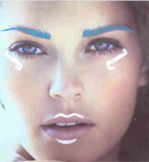
This look that I designed started as a facechart, and I really like the structured eyebrows and lines that frame the eyes. I think that the structured shapes reference the wall art that the inuits produced. I have researched these wall drawings and shown them in my previous posts. I also like the shading on the cheekbones and think this would be effective if it was a silvery colour with a glittery sheen to it.


The image below shows my idea of what the template would look like on an actual model's face. I really like the simplicity of the white on the skin, and the pinky lips give a frosty effect. 


I also tried this design with blue eyebrows. I really like the idea of using blue within the piece, and think that against 'cold-looking' skin, this would look really effective. 


My hair designs for the looks above is shown below. I really want to use fishtail plaits within my looks, and really like the idea of it looking very messy but fashionable at the same time. I want the french-fishtail to go across the forehead and the hair to then be swept to the side and fishtail plaited again. I also want to fasten the plaits with threads that look like pieces of suede or something similar to this, I think that it would really link in with the Inuit tribe. 


Below: A side view of my hair ideas.


I also wanted to show some other designs that I produced when developing the above look, some of these I prefer more than others, so I think that it would be helpful for me to outline what I like and what I don't about each picture:

- I really like the outline of the lips, and how simple it is.
- I dislike the liner around the eye as I feel that it almost gives an Aztec feel to it. 
- I fear that the lips will not look as effective as they do on the image as they would on an actual model.


- I really like the details on the lips and how they look like they are really shiny just with the two lines drawn on them.
- The lines on the eyes are effective in illuminating them and creating an interesting but simple pattern.
- I think that it is far too simple and that I can showcase my techniques better than this.


- I really like the white lips in this image however I do not think that this would be effective on my model. 
- The lines of the eyes are too elegant and I envisage my look to be much more fierce and structured. 


- Again, I feel that the lines around the eyes give more of an Aztec influence and I do not think that this shows my idea at all.
- I really like the outline of the lips and think that it gives a more 3D painting look. 


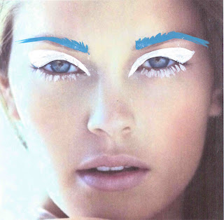
I think that this image (below) is one of my favourite designs that I have done, however it gives me a lot of issues with how it would actually be applied onto the model. I would have worries that the white on the lids of the eyes are more like white eyeshadow when being applied and would not look as quirky as it does on the screen. I really like the white eyelashes on the bottom and think that it really influences the texture of snow and the idea of frosting on the eyelashes. 


Tuesday, 13 November 2012

Catwalk: Hair design for first look

Below shows a very rough design of the first idea for the Inuit tribe Catwalk look. I really like the idea of using plaits and different threads/strings wrapped around the hair. I think that the plaits are very current but will also reflect the Eskimo tribe. I vision my model to have very white blonde hair and would like to keep this design throughout the process of designing the look for catwalk. I am not sure if I like the waviness of the bunches and don't think that it looks very fashionable as they are drawn now. I think that I will keep the idea of plaiting and threads, but I will also take the wavy hair and make it into something else, maybe more textured and afro-like, or maybe more plaiting and keeping the look more sleek and straight. 
I plan to continue designing makeup looks along with hair looks until I have created my Inuit Catwalk look. I will then move onto looking at the more colourful tribe after this has been finalised.


Catwalk: My first Inuit facechart

I have began designing the looks for my catwalk images. I have decided to do this first as I feel that it will be the hardest one for me to pull together, so I want to give myself more time to create and design the looks. I have provisionally got one model, however I want to design the looks as soon as possible so that I can make sure that she is correct for the look that I want to produce. 
I need to consider the face that it will be for catwalk, not Editorial, and I think that I need to keep hammering it into my mind because I am so used to designing for editorial.
The images for the facecharts are shown below: 
Inuit Facechart
Emily Murphy
Inuit Facechart on a model
Emily Murphy


Hair Designs will follow for this look! 

Hair Hair Hair!

Yesterday we had a Wigmaker and hair stylist come in to speak to us. Seema Chopra has worked with so many different companies and in different productions and I was really inspired by what she does. She has worked for and designed wigs for Rankin, the Diet Coke adverts, and a surrealist photographer Madam Peripetie. She designs everything from blue afros with holes in to natural wigs for celebritys that need a change for a certain character/band member.
Some examples of her work are shown below:


Photographer: Madam Peripetie
Wigmaker: Seema Chopra
La Grande Macabre
Full body hair suit by
Seema Chopra


Photographer: Rankin
Wigmaker: Seema Chopra
Diet Coke Advert
Wigmaker: Seema Chopra
Seema Chopra has such a wide variety of work that she can show that it must be so exciting working in the industry that she does. She also spoke to us about the different types of hair that can be bought, some quite cheaply, others more expensive. 
The different types of hair that she spoke to us about was:

- Acrylic hair (made from plastic, not suitable for films and close up work because the fibres are shown through on camera, should be used for a more creative and striking look, can be found in much more of a variety of colours and lengths. Acrylic hair is also much cheaper than human hair.)
- Human hair (gives more of a natural look, heat can be applied, much harder to build structure, can be very colour restricted, however the hair can be coloured just as normal hair is coloured. Human hair is also very expensive.)
- Hair weft is when all of the hair is stitched and attached to a long line of string, clips can be added to form the very popular clip in hair extensions. 
- Loose hair is not stitched together so it is loose, and is called 'yaki' hair. 

Seema Chopra also spoke to us about her wig kit, and what she has to have to create a wig:

- Hair weft and colours (a variety of textures and lengths for required look)
- Drawings of look she wants to create
- Pins, grips, hairsprays (Tresemme and fudge skyscraper) 
- Colour sprays
- Padding for creating the required shape
- Wire, pliers
- Elastics
- Glues - Copydex for hair to hair, and wig glues for hair to skin.
- Hair gels.

Suppliers that she spoke to us about with regards to wig tools and kits were Screenface and Charles Fox. 

The lecture really made me think about hair designs and what I will do for my project. I would like to use a wig in at least one of my looks, and think that it will create a really effective dimension to the project, something that I have never experimented with before. 

Seema's website is: http://seemachopra.com

Saturday, 10 November 2012

Visiting the British Museum

In the last couple of weeks, I visited the British Museum and was really excited by what I saw. All of the separate exhibitions that I saw really opened my eyes to different cultures and gave me a lot of inspiration to start designing for both my catwalk and editorial looks. 
Below are a selection of the images that I took while I was there that are very narrowed down; I took over 200!